Beyond Corporate Blue: How Forward-Thinking B2B Brands Are Using Color to Break from the Pack
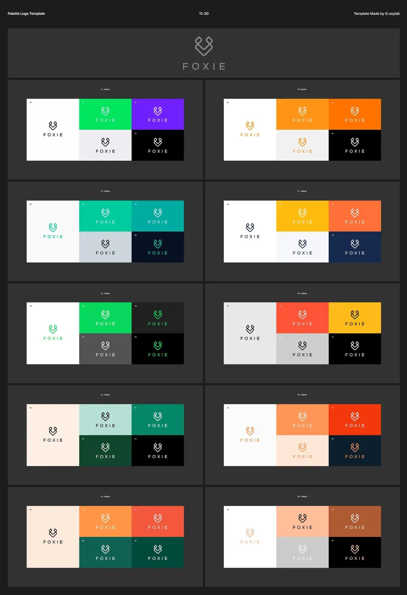
Photo: colorful modern B2B tech company branding color palette design, via i.pinimg.com
Open any B2B technology company's website from 2015 and you will find an almost identical palette: some shade of blue, a clean white background, perhaps a dash of gray for sophistication. It was a formula that communicated stability, professionalism, and trustworthiness — values that enterprise buyers historically rewarded.
That formula is now working against the companies still using it.
In a market where dozens of SaaS platforms, cybersecurity firms, and cloud infrastructure providers have converged on virtually identical visual identities, blue no longer signals trustworthiness. It signals sameness. And in 2024, sameness is arguably the most dangerous position a B2B brand can occupy.
The Blue Saturation Problem
The data is striking. A 2023 analysis of Fortune 500 B2B technology company logos found that approximately 65 percent incorporated blue as a primary brand color. In the cybersecurity subsector specifically, that figure climbs even higher. The effect is a visual marketplace where differentiation has nearly collapsed at the color level.
This matters more than it might appear. Research in consumer psychology consistently demonstrates that color is the first visual element processed by the human brain — before shape, before typography, before imagery. When every competitor in a category uses the same color family, a prospective buyer's ability to distinguish between brands at the perceptual level is fundamentally compromised.
For B2B marketers investing heavily in content, demand generation, and account-based marketing programs, this is a significant structural problem. If your brand cannot be visually distinguished from three of your closest competitors at a glance, every other marketing investment becomes less efficient.
Why the Shift Is Happening Now
Several converging forces are driving B2B brands to reconsider their color strategies in 2024.
First, the buyer journey has become predominantly digital. Enterprise purchasing decisions that once involved in-person meetings, printed collateral, and trade show booths now unfold almost entirely across digital touchpoints — websites, LinkedIn, email, video calls, and digital advertising. In these environments, color contrast and visual distinctiveness carry even greater strategic weight. A bold, unexpected brand color that stands out in a LinkedIn feed or a crowded inbox has measurable performance implications.
Second, the demographic profile of B2B buyers is shifting. Millennials now represent the largest segment of B2B decision-makers in the United States, with Gen Z entering the workforce in purchasing roles at an accelerating pace. These cohorts bring different aesthetic expectations — shaped by consumer brands, digital-native design sensibilities, and a cultural fluency with visual communication that older buyer demographics did not share. They are less likely to interpret an unconventional brand color as a risk signal and more likely to interpret visual conservatism as a lack of innovation.
Third, the rise of brand-led growth as a B2B strategy has elevated the importance of emotional resonance in what was once a purely rational purchase category. Companies like Notion, Figma, and Loom built substantial enterprise customer bases partly by treating brand design as a product differentiator — and all three made deliberate choices to avoid the blue-and-gray conventions of legacy enterprise software.
The Psychology Behind the Colors Gaining Ground
So which colors are emerging as the beneficiaries of the shift away from blue, and what psychological work are they doing?
Green has seen significant adoption among fintech and sustainability-adjacent technology companies. Beyond its obvious environmental associations, green carries psychological connotations of growth, forward momentum, and financial health — attributes that resonate strongly with CFO-level buyers. Brands like Robinhood and Affirm have demonstrated that green can carry authority in financial contexts without sacrificing the warmth that drives user engagement.
Orange and amber are appearing with increasing frequency in productivity software and collaboration tools. These colors communicate energy, accessibility, and optimism — qualities that align well with products positioned around team performance and workflow improvement. HubSpot's long-standing commitment to orange is instructive: in a CRM category that skewed heavily blue, the choice created immediate visual distinction that reinforced the brand's positioning as a more approachable alternative to enterprise-heavy competitors.
Purple has emerged as a signal of premium positioning and creative sophistication, particularly in AI-adjacent technology and analytics platforms. Its associations with imagination and depth make it well-suited for products that promise transformative capability rather than incremental efficiency gains.
Black and near-black palettes are gaining traction among cybersecurity and infrastructure companies that want to convey authority and precision without the approachability associations that blue now carries. Crowdstrike's aggressive use of dark backgrounds and high-contrast red accents is a notable example of a security brand using color to project confidence rather than reassurance.
A Framework for Choosing Your Brand Color
Abandoning blue — or any established convention — is not inherently wise. The goal is not novelty for its own sake. The goal is strategic differentiation grounded in a clear understanding of your audience, your competitive landscape, and the emotional territory your brand needs to own.
Here is a practical framework for approaching that decision.
Step one: Map the competitive color landscape. Before making any color decisions, conduct a systematic audit of your top ten to fifteen competitors' visual identities. Identify which color families are saturated and which represent open territory. This alone will reveal differentiation opportunities that pure aesthetic preference would miss.
Step two: Define the emotional territory your brand owns. What is the primary feeling you want a prospective customer to associate with your company after their first interaction? Trust? Innovation? Precision? Warmth? Each of these territories maps to different color psychology profiles, and your brand color should reinforce — not contradict — the emotional experience your product and team deliver.
Step three: Consider your buyer's context. Where will your brand color appear most frequently? If the answer is primarily LinkedIn and digital advertising, test your color choices specifically within those environments. A color that reads beautifully in a brand guidelines document may perform very differently as a 300x250 display ad unit against a white background.
Step four: Test before committing. Brand color decisions are not irreversible, but they are expensive to change. Invest in audience research — even lightweight survey-based testing — before finalizing a color direction. Measure not just preference, but recall and emotional association. The color your target audience finds most memorable is often more strategically valuable than the one they find most attractive.
The Differentiation Dividend
The companies that will own their categories in the next five years are not the ones that played it safe with a familiar palette. They are the ones that understood color as a strategic asset — a lever for perception management, competitive positioning, and emotional resonance that operates before a single word of copy is read.
Blue is not dead. It remains a powerful tool in the right contexts, deployed with intention and differentiated execution. But the era of defaulting to blue because it feels safe is coming to an end.
At DesignBB, we believe that bold brands are built on deliberate choices — and that color is one of the most powerful, most underutilized tools available to B2B organizations ready to stop blending in and start standing out.