Silent Signals: How Your Font Choices Shape Customer Trust Before a Single Word Is Read
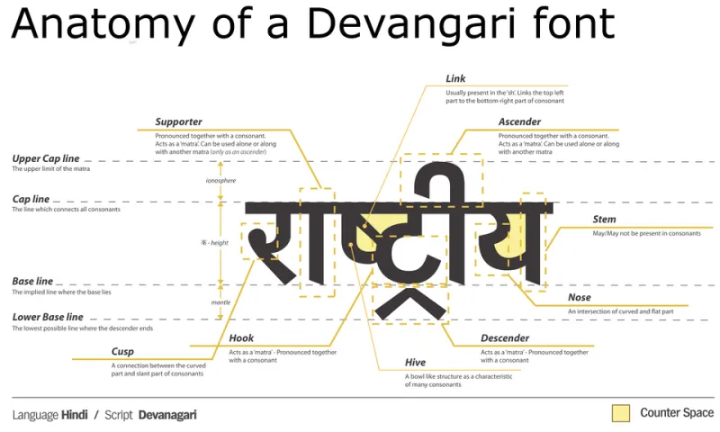
Photo: JMF, CC0, via Wikimedia Commons
There is a moment — measured in milliseconds — when a potential customer lands on your website, glances at your packaging, or opens your proposal and forms an opinion about your business. They haven't read your headline. They haven't absorbed your value proposition. They've simply seen your brand. And in that fraction of a second, your typography has already done significant damage or earned considerable goodwill.
Font selection is one of the most underestimated levers in brand strategy. For many American businesses, typeface decisions are made once — often during an initial website build or logo design sprint — and then quietly forgotten. What follows is a slow accumulation of typographic inconsistency, mismatched hierarchy, and eroded credibility that no amount of compelling copy can fully overcome.
The Psychology Behind Typeface Perception
Research in cognitive psychology consistently demonstrates that visual presentation shapes how we evaluate the content within it. A 2012 study published in Cognition found that readers rated identical text as more credible when set in a font perceived as authoritative. Baskerville — a serif typeface with roots in 18th-century English typography — outperformed Comic Sans by a statistically significant margin on trust metrics alone.
This isn't merely academic. Serif typefaces such as Georgia, Garamond, and Times New Roman carry centuries of association with print journalism, legal documents, and scholarly publishing. They communicate permanence and authority. Sans-serif typefaces like Helvetica, Inter, and Futura read as modern, efficient, and clean — qualities that resonate strongly in technology, healthcare, and consumer product categories. Script and display fonts, used judiciously, can evoke warmth, creativity, or luxury. Used carelessly, they undercut every claim of professionalism on the page.
The mistake most businesses make is not choosing the wrong font outright — it's choosing a font without understanding what that font communicates, and then applying it inconsistently across touchpoints.
Common Typography Mistakes That Undermine Conversion
Misaligned personality. A personal injury law firm using a rounded, playful sans-serif sends a confusing signal to someone in a moment of genuine crisis. Conversely, a boutique children's clothing brand using a rigid, corporate typeface fails to invite the emotional warmth its audience expects. Typography must reflect the brand's actual personality — not the founder's aesthetic preference.
Hierarchy collapse. When headlines, subheadings, body copy, captions, and calls-to-action all look similar in weight and size, readers lose their visual roadmap. The eye has nowhere to land, and attention dissipates. Strong typographic hierarchy is the scaffolding that guides a customer from awareness to action.
Readability failures on digital screens. Print-friendly typefaces don't always translate to screens. Fonts with thin strokes, tight letter-spacing, or low x-heights can become difficult to read at standard body copy sizes, particularly on mobile devices — where the majority of American web traffic now originates. If your audience is straining to read your content, they are not buying from you.
Typeface proliferation. Using four, five, or six different fonts across a brand's materials is one of the most common symptoms of design debt. It typically happens gradually — a new team member picks a different font for a campaign, a vendor uses whatever was available in their template — and the cumulative effect is a brand that looks fragmented and unprofessional.
Auditing Your Typographic System
A typographic audit doesn't require a full rebrand. It requires honest inventory and a willingness to impose discipline. Here's a practical starting point:
Step one: Document what you're actually using. Pull together your website, email templates, social media graphics, proposals, and any printed materials. List every typeface currently in use. Most businesses are surprised by how many they find.
Step two: Evaluate against brand personality. For each typeface, ask whether it communicates the qualities your brand is built around. If your brand promises expertise and trust, does your typography feel expert and trustworthy?
Step three: Test for readability across devices. Open your website on a smartphone. Reduce the browser window to simulate a tablet. Read your body copy aloud — if you stumble, your readers will too.
Step four: Consolidate to a disciplined type system. A well-constructed typographic system typically requires no more than two typeface families — one for display and headline use, one for body copy — with clearly defined size, weight, and spacing rules for each application. This is not a creative limitation; it is a strategic one.
Building a Type System That Converts
The brands that consistently outperform their competitors on conversion metrics tend to share a typographic quality that is difficult to name but immediately felt: coherence. Their fonts feel intentional. Their hierarchy is clear. Their visual voice is consistent whether you encounter them in a Google ad, an email, or a physical storefront.
For businesses investing in this area for the first time, the return is not speculative. Improved readability reduces bounce rates. Clear hierarchy guides users toward conversion actions. Consistent type application builds the kind of brand recognition that compounds over time — reducing the cost of customer acquisition with each passing quarter.
Typography is not decoration. It is infrastructure. And like any infrastructure, it either supports the weight you're putting on it, or it quietly fails under pressure.
At DesignBB, we treat typographic systems as foundational brand assets — because that is precisely what they are. If your fonts aren't working as hard as your sales team, it may be time to put them under a serious lens.