The Strategic Power of Imperfection: Why the Best Brands Are Embracing What Machines Cannot Fake
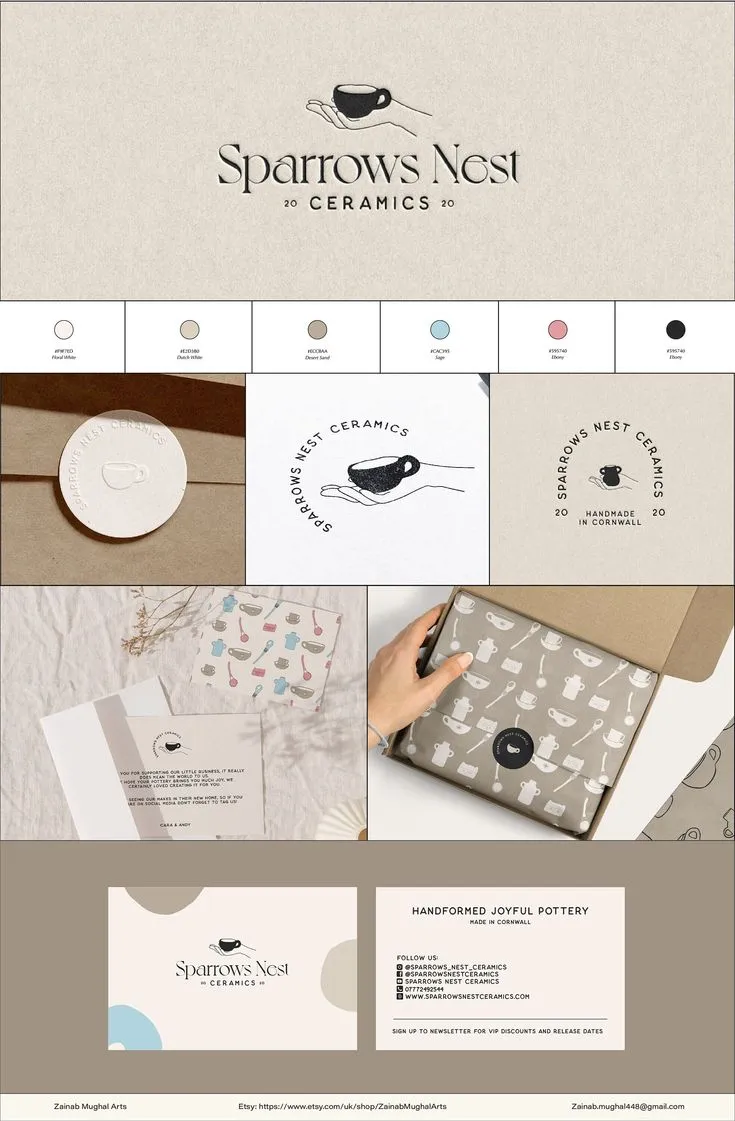
Photo: hand-drawn brand identity design rough texture artisan packaging creative studio, via i.pinimg.com
The Perfection Problem
For the better part of two decades, digital design culture has pursued a particular ideal: smooth, scalable, pixel-perfect. Vector graphics replaced hand-drawn illustration. Photography presets standardized color grading across entire brand libraries. Motion design became choreographed with mathematical precision. The tools improved, the output became more polished, and somewhere in that process, something essential began to disappear.
That something is the visible evidence of human presence.
A growing body of consumer research, combined with observable market behavior, suggests that audiences—particularly younger American consumers—are developing a form of aesthetic fatigue around hyper-polished brand presentation. When everything looks optimized, nothing looks real. And when nothing looks real, trust erodes.
This is the context in which deliberate imperfection has evolved from a stylistic curiosity into a legitimate brand strategy.
What Imperfection Actually Communicates
Before examining how brands are deploying imperfection strategically, it is worth being precise about what the term encompasses—because imperfection in design is not a single thing.
It includes tactile and textural elements: paper grain, ink bleed, uneven letterpress impression, visible brushstroke. It includes structural irregularity: hand-lettered typography with inconsistent baseline alignment, illustrations where the line weight varies naturally rather than uniformly. It includes compositional asymmetry that reads as human arrangement rather than algorithmic layout. And it includes process visibility—the sense that a human being made deliberate choices, encountered resistance, and produced something that bears the marks of that encounter.
Each of these elements communicates something specific. Texture communicates materiality and craft. Irregularity communicates individuality and care. Asymmetry communicates energy and spontaneity. Process visibility communicates honesty.
Combined, they communicate what polished digital design increasingly cannot: that a human being made this, and that the brand behind it is operated by human beings who value the same qualities their customers do.
The Premium Signal
One of the more counterintuitive developments in contemporary American brand design is the adoption of imperfection as a premium signal. Historically, rough or unfinished aesthetics were associated with budget constraints—you got hand-lettered signage when you could not afford a professional typographer. That association has largely inverted.
High-end food and beverage brands have led this shift. Consider the category of premium olive oils, specialty coffee, and artisan chocolate, where hand-stamped labels, uncoated paper stocks, and deliberately irregular logo marks now command shelf presence—and price premiums—over competitors with technically superior print production. The imperfection is not incidental; it is the argument. It says: this was made by someone who cared enough to do it by hand, and that care is embedded in the product itself.
Luxury fashion has made similar moves. Several heritage American leather goods brands have leaned into visible stitching irregularities, natural surface variation, and handwritten interior stamps not because manufacturing precision is beyond their reach, but because those imperfections communicate what machine perfection cannot: that a skilled human being touched this object.
Emerging Brands and the Authenticity Dividend
For emerging brands without heritage to draw on, deliberate imperfection offers a different kind of strategic value. In a digital marketplace where a small brand's website and social presence are its primary storefronts, the visual language of imperfection creates an immediate differentiation from the algorithmically optimized presentation that large-budget competitors default to.
A hand-drawn logo mark, even one executed by a professional illustrator, reads fundamentally differently than a vector wordmark. It suggests a founder who made considered choices rather than a marketing committee that approved safe ones. In categories where authenticity and founder identity are part of the value proposition—specialty food, independent apparel, wellness products, craft spirits—that reading is commercially significant.
This is not an argument for amateurism. The most effective deployment of imperfection in emerging brand design is executed with considerable professional skill. The hand-drawn mark is drawn by someone who understands proportion, weight, and visual balance. The rough texture is applied with compositional intention. The asymmetry is deliberate rather than accidental. The imperfection is crafted, not merely permitted.
The Framework: When Imperfection Strengthens vs. When It Undermines
The practical question for brand strategists and design teams is not whether imperfection is valid, but when it is appropriate. The following framework offers a starting point for that assessment.
Imperfection strengthens a brand when:
- The brand's core proposition involves craft, human skill, or artisanal process. Imperfection is not decoration here—it is evidence.
- The target audience has demonstrated fatigue with category conventions that favor polish and optimization. Imperfection provides pattern interruption.
- The brand has the design sophistication to execute imperfection with intentionality. Rough elements must be rough on purpose, not by default.
- The imperfection is consistent and systematic across brand touchpoints, rather than appearing randomly in some executions and not others.
Imperfection undermines a brand when:
- The brand operates in a category where technical precision is a core trust signal. A fintech platform, a healthcare provider, or a legal services firm that deploys casual, hand-drawn visual language may inadvertently signal carelessness in domains where carelessness is consequential.
- The execution lacks skill. There is a meaningful difference between a professionally crafted rough mark and one that simply looks unfinished. Audiences read that difference accurately.
- The imperfection is inconsistent—appearing in some contexts and absent in others—which reads as oversight rather than intention.
- The brand's audience skews toward demographics that associate polish with quality and credibility. This varies significantly by sector, region, and age cohort.
Designing for Human Connection in an Automated Landscape
The broader significance of this trend extends beyond aesthetics. The growing commercial value of visible human imperfection in brand design is, in part, a market response to the accelerating automation of creative production. As AI-generated imagery becomes more technically capable and more widely deployed, the visual markers of human authorship acquire scarcity value.
This creates a durable strategic opportunity for brands willing to invest in genuine craft. Not the simulation of craft, not the filter that adds grain to an otherwise machine-produced image, but the actual involvement of skilled human hands in the production of brand assets.
The brands that understand this distinction—and build design systems that honor it—are positioning themselves for a form of differentiation that becomes more valuable, not less, as automated perfection becomes the default. In that environment, imperfection is not a compromise. It is a competitive advantage that no algorithm can replicate.