When Your Brand Speaks One Language and Looks Like Another: Closing the Voice-Visual Gap

Photo: Unknown authorUnknown author, Attribution, via Wikimedia Commons
The Problem No One Puts a Name To
Imagine walking into a restaurant where the menu is written in cheerful, casual prose — lots of exclamation points, friendly asides, the kind of copy that feels like a text from a good friend — but the interior is stark white, the lighting is clinical, and the staff move with the formality of a five-star hotel. You cannot quite explain why you feel unsettled, but you do. Something does not add up.
This is precisely what happens when a brand's voice and its visual identity are pulling in different directions. Customers rarely diagnose the problem with the precision of a strategist, but they register it nonetheless. It surfaces as a vague sense of distrust, a hesitation before purchasing, or a quiet decision not to return. In competitive US markets where brand loyalty is earned rather than assumed, that cognitive friction carries a real cost.
The challenge is that voice and visuals are typically developed in separate rooms — sometimes by entirely separate teams, vendors, or agencies — and then handed off to one another with the expectation that coherence will emerge organically. It almost never does.
How the Disconnect Develops
Brand voice and visual identity tend to evolve on different timelines. A company might invest in a thorough messaging overhaul following a shift in leadership or market positioning, producing a rich tone-of-voice document full of personality descriptors: bold, empathetic, straight-talking, human. Meanwhile, the visual identity from a rebrand three years prior was built around a different set of values — perhaps projecting institutional authority or premium exclusivity — and no one has formally revisited whether the two systems still speak to the same idea.
The reverse scenario is equally common. A brand refreshes its logo, updates its color palette, and adopts a warmer, more contemporary aesthetic, but the copy across its website, email campaigns, and social channels still carries the stiff, formal register of a decade-old corporate communications style. The visuals have moved forward; the words have not followed.
Neither situation is the result of incompetence. It is the predictable outcome of siloed workflows and the absence of a single governing framework that treats voice and visuals as two expressions of the same underlying brand truth.
What Customers Are Actually Experiencing
Research in consumer psychology consistently demonstrates that people process brand communications holistically. When the emotional register of written content conflicts with the emotional register of design, the brain must resolve that tension — and it does so by defaulting to skepticism. The brand feels inauthentic, even if the individual components are each well-executed in isolation.
Consider a financial services firm that has invested heavily in repositioning itself as a trusted partner for everyday Americans — approachable, transparent, on your side. Its new brand voice reflects this: conversational, jargon-free, empathetic in tone. But its visual identity still leans on deep navy, formal serif typography, and imagery of suited professionals in glass towers. The messaging says "we are human." The design says "we are an institution." Customers hear both signals simultaneously, and the contradiction undermines the very credibility the repositioning was meant to build.
Or consider a direct-to-consumer wellness brand that has cultivated a visually soft, earthy aesthetic — muted greens, organic textures, hand-drawn illustration. But its copy is clinical, dense with ingredient lists and efficacy claims, written in a tone better suited to a pharmaceutical insert. The look promises nourishment and calm. The words deliver a compliance document. Again, the mismatch erodes the emotional contract the brand is trying to establish.
The Audit: Reading Your Brand as a Stranger Would
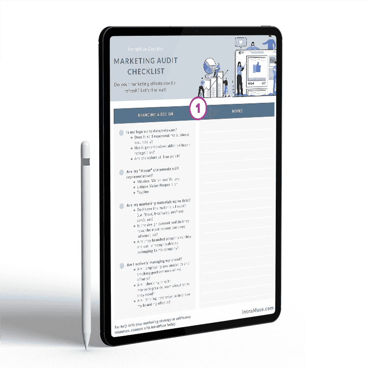
The most effective way to identify a voice-visual gap is to conduct a structured coherence audit — one that requires you to evaluate your brand not as someone who built it, but as someone encountering it for the first time.
Begin by assembling a representative sample of brand touchpoints: your homepage, a recent email campaign, a social media post, a product page, a printed brochure if applicable. Then strip them into two separate piles: one containing only the visual elements (layouts, colors, imagery, typography), and one containing only the copy (headlines, body text, calls to action, taglines).
Evaluate each pile independently. For the visuals, write down five adjectives that describe the emotional register of what you see. For the copy, do the same. Then compare the two lists.
If the adjective sets are meaningfully different — if the visuals feel "authoritative, minimal, and cool" while the copy reads as "warm, casual, and playful" — you have identified a coherence problem. The greater the distance between the two lists, the more urgently the brand requires realignment.
Building a Framework for Coherence
Realigning voice and visuals is not a matter of simply rewriting copy or refreshing a color palette. It requires returning to the foundational question: what is the single emotional experience this brand is meant to deliver?
That answer must be documented in a way that is accessible to every team or vendor who touches the brand — designers, copywriters, social media managers, UX teams, and marketing partners alike. Many organizations maintain a visual brand guide and a tone-of-voice guide as entirely separate documents. The more effective approach is a unified brand expression framework that explicitly maps the relationship between the two.
This document should articulate not just what the brand looks like and how it sounds, but why those choices connect to the same underlying values. A brand committed to transparency, for example, might express that value visually through open white space and unadorned typography, and verbally through short sentences, active voice, and the deliberate avoidance of corporate euphemism. When the rationale is shared, the outputs align more naturally.
Beyond documentation, coherence requires process. Creative briefs should include both visual and verbal direction from the outset, ensuring that designers and copywriters are working from the same emotional brief rather than handing work back and forth after the fact. Regular cross-functional reviews — where design and messaging teams evaluate work together rather than in sequence — catch misalignments before they reach the audience.
The Competitive Advantage of Coherence
In a media environment where US consumers are exposed to thousands of brand impressions daily, coherence is not a cosmetic concern. It is a strategic one. Brands that speak and look like the same entity earn a form of trust that no single campaign can manufacture. Customers do not have to work to understand what the brand stands for — the message arrives whole, from every direction, and it lands.
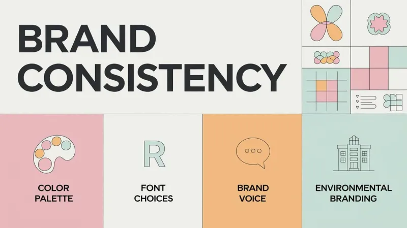
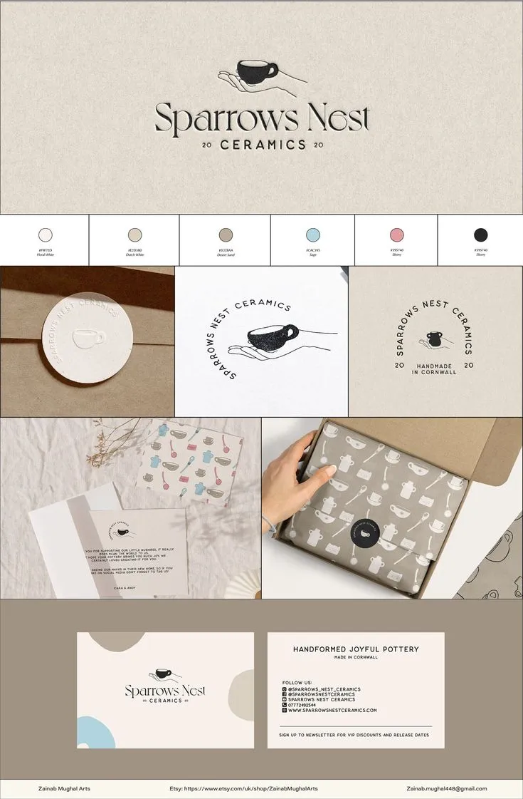
For design teams and brand strategists, this means expanding the definition of brand consistency beyond visual standards. Color and logo usage matter. So does the question of whether your headlines feel like they were written by the same sensibility that chose your typeface.
The brands that get this right are not the ones with the most elaborate guidelines. They are the ones where someone, at some point, insisted that the people responsible for how the brand looks and the people responsible for what the brand says be in the same room — and stay there long enough to build something unified.
That insistence is where bold branding begins.